Definitely NOT a tower defense
How to play (here from text or by looking at some photos)
use only the mouse (and p or esc to pause)
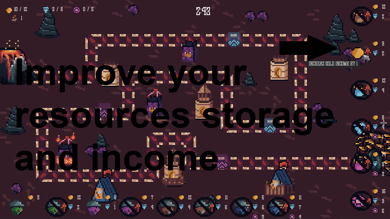
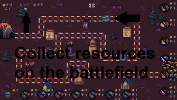
Top left of the screen: resources
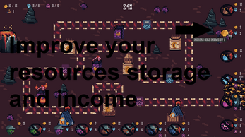
Right of the screen: Upgrade for resources (their storage amount and income)
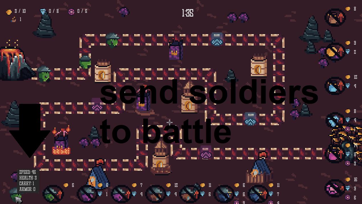
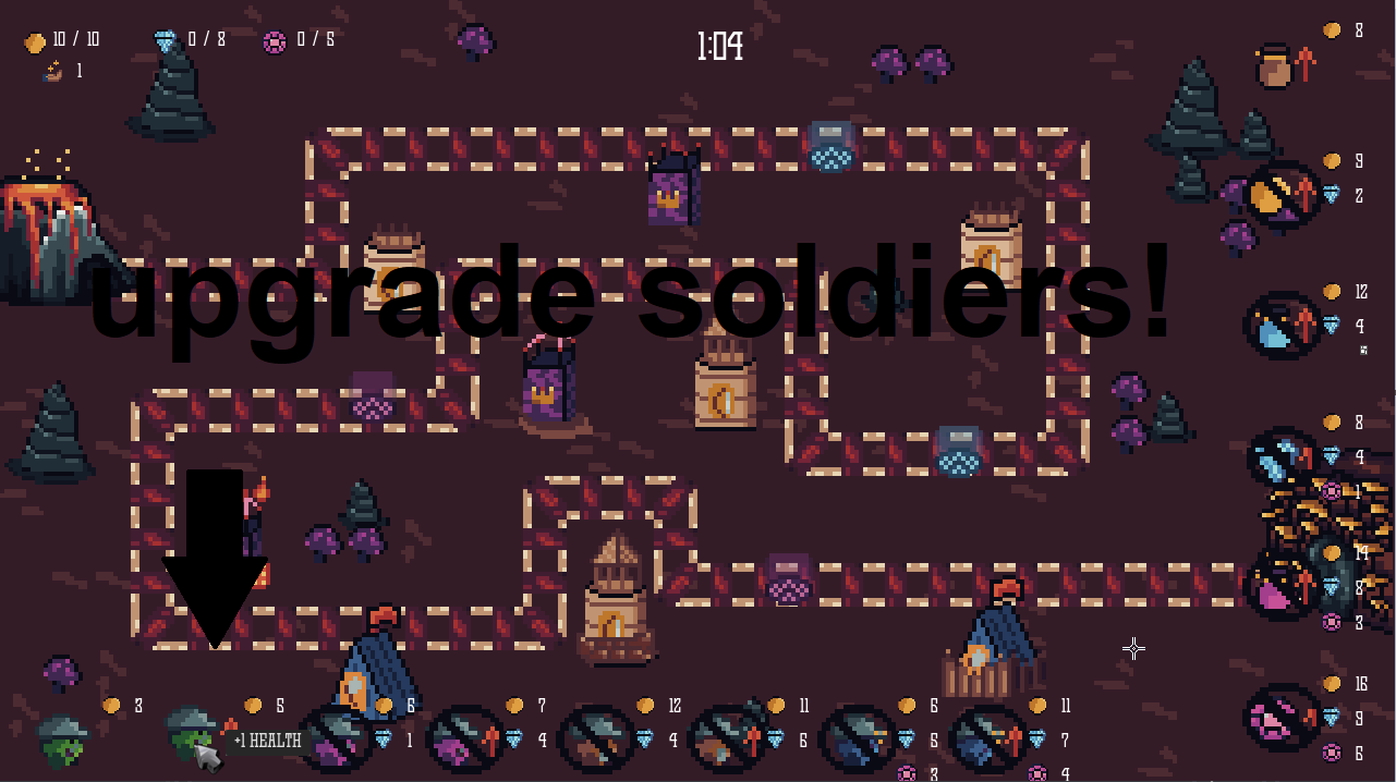
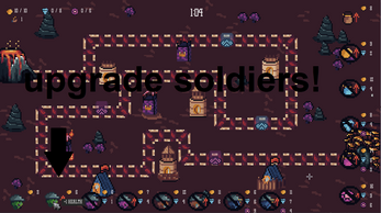
Bottom of the screen: Buy soldiers or upgrade them (with the arrow up is the upgrade)
Get advanced resources by sending a soldier on a portal, it will give you resources of that portal's type equal to the soldier carry amount
Armor prevents damage taken from the towers, so a 2 armor unit gets only 1 damage from a 3 damage
Any information you can see by hovering something
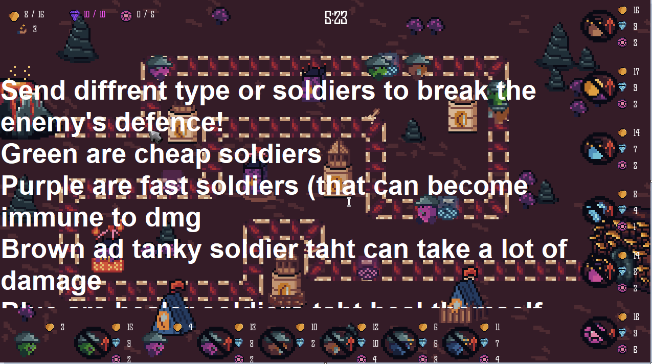
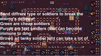
Green soldiers are basic ones,, use the to get resources or upgrade them for a late game army
Purple soldiers are the fast ones, and if upgraded enough they can become immune to damage for a short time
Brown soldiers are your tanks, slow, a lot of health and armor
Blue are your healers, heal themselves and everyone in range for their heal amount
Fire towers damage anything their fireball pass throw (and aoe dmg on impact)
Thanks for everyone for the feedback, hope this clears a few things
Hope this helps you to play the game as intended, sorry for the bad UI/UX and really appreciate it if you finished the stage!


Comments
Log in with itch.io to leave a comment.
A very well crafted game, my only problem for me is that it seems you can not really loose, your only goal is to get a shorter time. I think the game would be a lot more fun if there was some way to loose. Maybe there can be a time limit, and you can increase the time limit that allows you to stay alive using gold. I do think the game has a lot of potential.
i love this! a really well done game, and the art is really good too.
very nice game wtf
Really good experience!
I love the artstyle and the music. The gameplay is nice and I really like how it flips the idea of tower defence on its head. The mechanics are all the same but they make you approach said mechanics in a different way.
My only gripe is that the font could be thicker and I cannot tell the difference between 5 and 6. Also some assets look a bit out of place like the buttons are way too high definition compaired to the rest of the game.